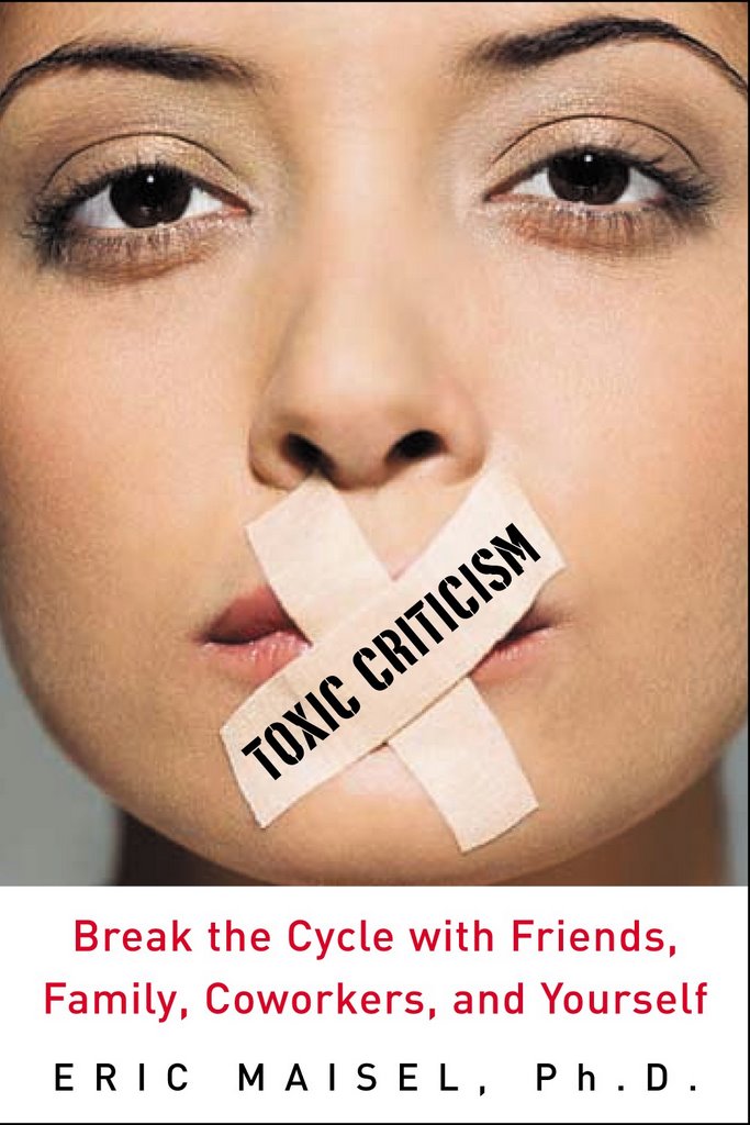
Is this book directed at silencing women?...Silencing ethnic women? That's the impression that the cover gives. Too bad it couldn't have been genderless. Toxic critics come in all shapes and sizes.
In my opinion, the people who chose this cover most likely wanted to convey the idea that all people give and receive criticism, and they saw this woman of color as just that, a person. Should we only put women of color on books that are being directly marketed towards women of color? Wouldn't that just continue to marginalize them? And furthermore, the first thing I thought when I saw this woman was that she was strikingly beautiful, and I think it's hard to deny that beautiful women are very privaledged and powerful in this society. Personally, I don't feel bad for her.
I question why the gender representation is decidedly female. I would have chosen male over female given our culture of abuse. The depiction also lends itself to a focus on verbal toxic criticism. Not knowing the content of the book, I question whether posture, eye contact and related body language are given full exploration? Along with voice, exposure to touch, sight, etc. can prove extremely toxic.
What the cover conveys to me is that the content of the book is directed at people who wish to stop giving toxic criticism. I don't think that is a credible premise. Toxic criticizers would never admit that they were mistaken, never mind, believe that they had hurt anyone.
At first glance, the cover didn't strike me as having sexist overtones, though I can see now how someone might be able to interpret it that way. I think it is definitely a striking image, though slightly confusing in its intent: is the model meant to be the one dishing out toxic criticism, or somebody who feels stifled by having heard it? Just my thoughts.
Yes - I think the Toxic Criticism cover is quite offensive. What were the designers thinking?
What about something symbolic? Perhaps a bunch of faceless beings, all shapes and sizes kind of greyed in the background, all shouting their criticism. Or just the words shown in a graphically interesting way. Any of this would be better than a female figure with her mouth taped shut!
The first thing that came to my mind when I looked at the cover was that the author was saying that we should silence women. And then I wondered if the author was suggesting that it was only women who offer toxic criticism.
It's hard to comment on the relevance of the cover to content without knowing the content! However, as it seems from the title to be a book directed at encouraging people to change their own approach and avoid "toxic criticism", then the image doesn't make sense since the tape over her mouth seems to smack more of censoring her - another form of toxic criticism? There is an element of gender/race issues in the image which some might find disturbing. I think though, that the title and the image are really giving out conflicting messages, hence the cover not being the best it could be! The design is also quite clinical and therefore not very appealing. Hope these comments help.
I don't necessarily see the cover as sexist, although it might have been better if it were gender neutral (just drawn or painted lips).
My bigger criticism is that the cover art
1) does not accurately convey the message of the book to me. Is she the critic? Who is her target, her own self? Who put the bandaids on her? Are they meant to heal her critical voice, or to silence her?
and 2)I don't find it visually-appealing.... the title text written diagonally across one of the band-aids is about the same size as the sub-text.
3)The balance is off, all the weight is above.
4) I'm trying to figure out what else it is I don't like about it, but it has something to do with color, that band of white and the plain-ness of the text. Kind of blah.
I'm sorry I don't have any real solutions to offer, though.
I actually like it. It is arresting in that it suggests that the reader of the book on criticism is, or is also, the criticizer. I obviously haven't read your book, but the subtitle, which includes "yourself" would seem to uphold that idea. I found it surprising, hard-hitting, but intriguing. And since I'm most interested in stopping my own self-criticism, I wouldn't be dissuaded from buying the book.
That said, the person in the photo could have appeared more androgenous and that might help more people identify with him/her...and avoid the "silencing women" angle. But this isn't a big deal to me (although I'm a woman) because I'm my own most toxic criticizer, and I imagine that might be true of many women.
Tell your editors, male or female, "you can do better than this." It won't convey what the content of the book is about. This must be a real challenge for you Eric, as I'm sure your content is in no way sexist or racial. My vote on this cover is thumbs down. LR
I am amazed at the venom and negative connotations perceived by the previous posters. It is a sad commentary on our society when people see threats and insults in a simple photo. That said, it might be more effective if the cover shows two people rather than one, since by definition toxic criticism requires a critic and a victim.
the cover of Toxic Criticism has it all wrong. This book is not about learning to sealing your lips, (and wouldn't duct tape work better?)-- it's about learning to massage your heart and regain the courage to create when you've been on the receiving end of toxic criticism.
I love this cover. I cannot see how the model herself is offensive unless it is her striking beauty. The artist is not saying "women" or "women of color" or whatever. Any subject of either gender would receive parallel comments from the detractors (or other detractors). And surely a white male would invoke "why not a woman of color?" comments. We must learn that the use of a model can and should be viewed neutral of race or gender.
I feel this cover is playing to to cliche. I would have prefered the type grafics had played to cliche with making the word toxic look toxic and the rest normal type. I don't believe there is any need to show any person. Tapping someones mouth shut is a rather crude method of dealing with toxic comments, which I'm sure is not the point or direction of the book.
As a photographer, it bothers me the tape going up her nose.
I don't like the cover at all. Would not buy a book with that picture on it - don't find her beautiful as someone else did and don't see why whether or not she is beautiful has anything to do with it. If you want people to understand the message of the book - go with something that makes a more positive statement about dealing effectively with toxic criticism- for me the implication of the photo is that the book advocates censorship. Surely not what you had in mind .
I like the cover, though the tape could be more skillfully applied. The comments toward gender or race are unnecessarily critical. I guess if you used a dog PETA might complain, but it is just a person could be anybody.
I edit books professionally, for Peachpit Press and other publishers. Please let your publishers know that in my opinion this cover sucks.
First, the topic of the book (toxic criticism) is specifically the harmful things that are said. The cover image, of a mouth being taped over, is about making someone shut up. Wrong concept.
The correct image, it seems to me, would be a guy (preferably unshaven -- a lout) with a megaphone shouting at a poor beleaguered artist. I haven't read the manuscript, but that would be my suggestion based on my knowledge of Eric's work.
Second, it's a female bondage image. Sells books, I'm sure, but when the book is designed to help people overcome toxic imagery and stereotyping, putting a toxic stereotype on the cover is just begging to lose precisely the customers you want to bring in.
This beautiful woman (with her eyes wide open) is choosing to deny her inclination to "go toxic" in her communication. She's looking for a better, a more thoughtful way to communicate. It's so easy to critize..to be negative..but how often do we achieve our goal as a communicator when we go down that path?
If I don't critize, then how do I get my point across? This cover says there is another way...why not pick up this book and see for yourself???
I suggest the woman has olive skin and brown eyes for visual impact - contrasting the white tape more effectively. Nothing more sinister.
Absolute CON. The editors have much re-thinking to do. Do the editors share their intent with you or your agent about this cover, apart from appealing to female censorship and poor photographic imaging to boot.
More women read self-help books then men and I can certainly identify with the cover. I would see it and think, maybe I could be and should be less toxic.
Sorry to differ, but a man on the cover would have made no sense to me.
It isn't that toxic critics don't come in all shapes and sizes.
earlier when i looked i thought the look in her eyes is too sexy, now i say, it sexualizes it. so it is confusing with this for the cover? and her skin colour then brings up questions of race with her mouth covered with toxic criticism. it is offensive.
It is an interesting and sad commentary that the publisher chose to use a woman to demonstrate "toxic criticism." The subtext of the message is that in some way women are harmful to creative expression. That notion, in and of itself, is VERY toxic. I think a creative use of "toxic words" rather than a face, would be a more accurate representation. In that way, people could focus on the the energy of the words, which is the source of the toxicity, not the messenger.
The cover is weak artistically since it is so symmetric and that makes it boring. It is also rather heavily black on top, white on the bottom--with a straight horizontal line dividing the two parts--again, not artistic or interesting.
I think it also fails to convey what I would like to see in this book--how to deal with the criticism. It seems to say "Oh, shut up" which is neither effective or practical as a solution.
The image is sexist in the extreme - it implies that everything a woman says is toxic - that only women are toxic. Also that women should be silenced. The eyes are very seductive and the book is not about seduction. Therefore it is a misleading image. Actually its just plain stupid - some adolescent boy designed it? It looks like a cheap novel about sex and crime. If I were the author I would be very angry about this cover. Kathy G. Australia.
The only thing appealing about this cover is that it has Eric Maisel's name on it - without knowing him I would pass on by thinking it was by some shockjock writer. The title is provocative and draws attention - I can see why you'd want to pair it with a provocative photo -- but this photo doesn't tell me what the book is about or how the author sees the world. If the author doesn't say, "Yes!! You got what I am saying!!" when he or she sees the jacket, I'd think twice about the design.
My first thought when I saw the cover was the person pictured was being forced to stop her toxic criticism. My 2nd thought was "Why was a woman chosen for the cover of this book?"
When I think of the phrase "toxic criticism", I think of poisonous words and attitudes polluting a world of fresh ideas. That's the picture that should be portrayed on the cover of your book, Eric.
This cover is a real bore and a put-off. Why does a flawless female face have to be used to sell everything in sight from books on complicated subjects like toxic criticism to cars to booze? What are we selling? Do publishers really think they have to glamourize everything in sight or nobody will notice it? Does everything have to be a commercial for itself? YAWN. And, if the publisher is pretending to offer 'diversity' by offering a face of ambiguous race it isn't working. Why not a truly dark, obviously black face, then (almost never happens), an old woman's face, a Native American face? So the choice just seems cowardly. It is annoying too - the idea that all humanity must be represented by people who are never, ever, ever over 22 years of age. And as for the comment of one of the recent commentators that there is such a thing as 'gender or race neutral' - come on, that is absurd.
Please tell your publishers you do not write 'cheese'. You write books of depth and quality and your cover should reflect that and not look like some sort of t.v. guide/vogue mag/tabloid cover/make-up add. Please quote me - I am one of the people who pays hard cash for your books regularly. Geeeeez.
If I were a client, and my ad agency showed me this as an advertisement for my book, I'd fire them. Before I did, I'd ask a few questions: --What research did you do to create this woman on the cover? --Does your reserach indicate that only women give toxic criticism? That seems unlikely. --Does your research show that only young people give toxic criticism? That also seems unlikely. --Is the idea of the book that women in general need to be silenced? --If the idea of the cover is that toxic criticism silences young women, it's not the obvious connection. It's also ageist, saying that once you are older, toxic criticism isn't important, or perhaps deserved. Certainly research shows that a face on the book cover gathers attention, but I think you could have created a better execution of the damage of toxic criticism. This seems like the first attempt of a combination of junior copywriter and junior art director. Fire them both and get a clear idea of your audience first.
The cover does not convey the meaning of your topic. Toxic criticism is an inner demon that is really tormenting you and which you project out onto others - an inner critic that won't shut up and uses you for a channel. The cover doesn't send this message. It places blame - and only uses bandaids to try to block the damage. You need a new cover. It doesn't serve your topic at all.
I have bought all your books and would buy this one too. But if I did not know the author I think the cover would put me off. I find it a quite violent image. When tape is torn off the mouth....? And my guess is the book is more about acceptance and all those good things, not about censoring anyone. My 2 cents anyway.
Eric, First reaction...YUK! Second reaction...Why? Sexism or not, without analysing why, this cover is disturbing. I would pass it by. In thinking about it, which I don't really want to do, but will because you are a profound teacher, and I want you to sell more books...I thought the book is about not listening to toxic critisism. This image says don't be a toxic critic , which is a great idea also, but not the topic of the book. Very confusing.
It's very eye-catching, which is what the publisher is interested in. It's manipulative and sexist. I think the publishers should rethink their decision: they could really do better. The cover is tacky and superficial for a profound subject.
This cover design conveys negative impressions at several different levels, not the least of which is its focus on only silencing the "toxic criticism." A "tape over the mouth silencing" approach would result in a void which would be impossible to maintain! Seems to me a cover image which emphasizes the TRANSFORMATIONAL aspects of moving from the "toxic criticism" to more "healthful somethings" would be both more accurate of the books content and more marketable to the public. pwh
Eric, With 30+ years behind me in advertising and marketing, please believe me when I say that the cover pictured here is toxic. The tape across the mouth of the young woman creates a degrading and insulting image and does nothing to clarify the title of the book.
An alternative might be a closeup of a sad face (from the nose up) with sad and weary eyes expressing their frustration, while above the head are the heads and shoulders of 3 or 4 people (perhaps mid-50s male, mid 50s female, and mid 30s female of various ethnic groups) spouting off angrily or simply with disregard to the person below them. This would be a more even-handed visual that could get the point across without targeting and alienating a particular demographic in your audience.
I agree with the comments on the cover. It does seem sexist to me. Perhaps if it was just the mouth it would create a different impression. However, it's obviously a woman and we already get a bad rap about gossip. The cover could very well be a turn off for some women.
Yes, indeed the cover is shocking!! AS IS TOXIC CRITICISM!!! And this is what the book is about. Why do we always need to be so safe??? Why are we always on our defences and “read” things in what is not there? Perhaps because we feel guilty and it presses a button deep down in us? In this instance, because our basic believe is still that woman spread toxic criticism? If I see this book in a store the cover would make me buy it to find out what it is about. Does it support my belief and or does it challenge it? Either way, I could only learn and grow from reading it! RELAX PEOPLE!!!! No animals, people or morals were hurt in the “making” of this cover. If you are offended, perhaps go deep and ask yourself why!!! Demyan
AnnA Rushton, UK author and broadcaster. Well, I found it offensive as a very stereotyped airbrushed woman who obviously needs to keep her mouth shut - who is hte book aimed at because I don't believe silencng toxic criticism is about keeping your mouith shut. It is much more profound and deeper than that. On a purely technical note, the image is so old-fashioned and dated that it doesn't 'speak' to the reader at all in contemporary terms and makes the books content seem not relevant somehow in present day culture, it looks lke a 1960's pastiche, whose time of being fashionable again, certainly in Europe, peaked last year and is now on the wane - there must be a better visual than this?! AmmA
I'd like to believe the book is about encouraging people to stop toxic critisism they are involved in. however the tape on the mouth seems to suggests that the lady is being forced to stop critisizing or speak up. She looks beautiful though...
and i dont subscribe to all the talk about racist/sexist tones of the cover. all this talk is another example of toxic critisism.
Toxic criticism isn't always (or even most often) verbal. It can come from the eyes, the body (posture) or even silence. (As an artist myself, I've come to recognize it in many different "languages.")
If the cover were appropriate to the book's content, it might be sexist and offensive...here it's just horribly off point.
....maybe its cos im indian. and female...but i just saw her as a random person who was silenced due to the much mentioned toxic criticism...i think i probably would pick it up an flip through(dont know about buying it) without pondering on any racist undertones of any sort...all in all..its ok
If I look at the picture without the book title what I see is someone who has been silenced by toxic criticism. That it is a woman and a person of color doesn't surprise me although it makes me angry that the world is this way, it is not the image that makes me angry. It is certainly striking and would get my attention in a book store.
Unfortunately for the message of the book, the subtitle changes the meaning. Break the cycle implies that the woman has been silenced for speaking toxic criticism and muddies the waters.
My main reaction as someone who deals in pitches and marketing is that the message of the cover is too ambiguous and adding in the potential for angry reacitons, is not good marketing, whether or not it is good or tasteful design.
After I first commented (I'm #9) on the cover yesterday I worried half the evening that I, myself, had been too "toxic" in my criticisms. I thought about the person who designed the cover, the art director who approved it, the publisher, Dr. Maisel and his agent(s). I worried that somewhere along the line, someone was going to be hurt by my, and others' opinions. Indeed, I was somewhat taken aback by the criticism of us critics.... LOL. It even crossed my mind that this could be an experiement to see how people would react.
Regardless of any of this, although some may believe we all have a social responsibilty to be polite and positive, the world just doesn't work that way. In the end I am responsible for how I react to others' opinions of me.
Today, I still stand by my opinions of the cover. I will probably buy it, because I know who Eric Maisel is, and I've read and benefited from many of his other books.
But the bottom line is that he and his publisher want to sell books. Many books. More books than last time, which means they need to attract NEW readers.
I am distracted by the woman's ethnicity and gender...it is a confusing picture but the title is intriguing and I would like to read what's inside - the cover needs improvement.
This cover looks more like a female/male magazine cover (trying to grab attention through sensational sexual topics). Although the artist who designed this cover does a great job in grabbing attention, I find that the design demeans the content and author of the book. I would not like to be seen reading a book (with this cover) in public (i.e. on buses/trains) just so to ensure that I would not invite 'weird' looks.
I like it. None of the critical remarks seem meaningful to me. It's beautiful. We have become far too literal. Let the ideas speak. I get it--silence the remarks before they reach you. It's great.
Gosh, I didn't think gender or race or silencing women at all. I just thought it is a pretty direct cover and I presume the book is about how criticism which isn't constructive harms the receiver and the giver ( and various theories, ramifications, ways we all do this etc etc). Isn't it amazing how conditioned responses can be? The comments on this are rather revealing, but why am I surprised?!
Without reading any of the other comments I must say that this gives the impression that the best way to handle toxic criticism is to make the other person shut-up, and it that means taping their mouth shut, then so be it.
I think what tape across someone's mouth implies is opposite of what Eric Maisel is attempting to convey within the book.
Is the model the one criticizing? If so it seems like it should be clearer by SOME visual clue that she is somehow toxic. Her gentle expression does not say that. Her rather blank pretty face doesn't say much of anything. Also the model is so feminine that I would get the impression that the book may be more directed toward women than men. If there is going to be someone representing toxic critisism, it should be both genders.


51 comments:
Is this book directed at silencing women?...Silencing ethnic women? That's the impression that the cover gives. Too bad it couldn't have been genderless. Toxic critics come in all shapes and sizes.
In my opinion, the people who chose this cover most likely wanted to convey the idea that all people give and receive criticism, and they saw this woman of color as just that, a person. Should we only put women of color on books that are being directly marketed towards women of color? Wouldn't that just continue to marginalize them? And furthermore, the first thing I thought when I saw this woman was that she was strikingly beautiful, and I think it's hard to deny that beautiful women are very privaledged and powerful in this society. Personally, I don't feel bad for her.
I question why the gender representation is decidedly female. I would have chosen male over female given our culture of abuse. The depiction also lends itself to a focus on verbal toxic criticism. Not knowing the content of the book, I question whether posture, eye contact and related body language are given full exploration? Along with voice, exposure to touch, sight, etc. can prove extremely toxic.
What the cover conveys to me is that the content of the book is directed at people who wish to stop giving toxic criticism. I don't think that is a credible premise. Toxic criticizers would never admit that they were mistaken, never mind, believe that they had hurt anyone.
I find this cover offensive because it is sexist.
At first glance, the cover didn't strike me as having sexist overtones, though I can see now how someone might be able to interpret it that way. I think it is definitely a striking image, though slightly confusing in its intent: is the model meant to be the one dishing out toxic criticism, or somebody who feels stifled by having heard it? Just my thoughts.
Yes - I think the Toxic Criticism cover is quite offensive. What were the designers thinking?
What about something symbolic? Perhaps a bunch of faceless beings, all shapes and sizes kind of greyed in the background, all shouting their criticism. Or just the words shown in a graphically interesting way. Any of this would be better than a female figure with her mouth taped shut!
d.l.clay
The first thing that came to my mind when I looked at the cover was that the author was saying that we should silence women. And then I wondered if the author was suggesting that it was only women who offer toxic criticism.
The image is quite off-putting on several levels.
It's hard to comment on the relevance of the cover to content without knowing the content! However, as it seems from the title to be a book directed at encouraging people to change their own approach and avoid "toxic criticism", then the image doesn't make sense since the tape over her mouth seems to smack more of censoring her - another form of toxic criticism? There is an element of gender/race issues in the image which some might find disturbing. I think though, that the title and the image are really giving out conflicting messages, hence the cover not being the best it could be! The design is also quite clinical and therefore not very appealing. Hope these comments help.
I don't necessarily see the cover as sexist, although it might have been better if it were gender neutral (just drawn or painted lips).
My bigger criticism is that the cover art
1) does not accurately convey the message of the book to me. Is she the critic? Who is her target, her own self? Who put the bandaids on her? Are they meant to heal her critical voice, or to silence her?
and 2)I don't find it visually-appealing.... the title text written diagonally across one of the band-aids is about the same size as the sub-text.
3)The balance is off, all the weight is above.
4) I'm trying to figure out what else it is I don't like about it, but it has something to do with color, that band of white and the plain-ness of the text. Kind of blah.
I'm sorry I don't have any real solutions to offer, though.
I actually like it. It is arresting in that it suggests that the reader of
the book on criticism is, or is also, the criticizer. I obviously haven't
read your book, but the subtitle, which includes "yourself" would seem to
uphold that idea. I found it surprising, hard-hitting, but intriguing. And
since I'm most interested in stopping my own self-criticism, I wouldn't be
dissuaded from buying the book.
That said, the person in the photo could have appeared more androgenous and that might help more people identify with him/her...and avoid the "silencing women" angle. But this isn't a big deal to me (although I'm a woman) because I'm my own most toxic criticizer, and I imagine that might be true of many women.
Tell your editors, male or female, "you can do better than this." It won't convey what the content of the book is about. This must be a real challenge for you Eric, as I'm sure your content is in no way sexist or racial. My vote on this cover is thumbs down. LR
I am amazed at the venom and negative connotations perceived by the previous posters. It is a sad commentary on our society when people see threats and insults in a simple photo. That said, it might be more effective if the cover shows two people rather than one, since by definition toxic criticism requires a critic and a victim.
the cover of Toxic Criticism has it all wrong. This book is not about learning to sealing your lips, (and wouldn't duct tape work better?)-- it's about learning to massage your heart and regain the courage to create when you've been on the receiving end of toxic criticism.
I love this cover. I cannot see how the model herself is offensive unless it is her striking beauty. The artist is not saying "women" or "women of color" or whatever. Any subject of either gender would receive parallel comments from the detractors (or other detractors). And surely a white male would invoke "why not a woman of color?" comments. We must learn that the use of a model can and should be viewed neutral of race or gender.
I feel this cover is playing to to cliche. I would have prefered the type grafics had played to cliche with making the word toxic look toxic and the rest normal type. I don't believe there is any need to show any person. Tapping someones mouth shut is a rather crude method of dealing with toxic comments, which I'm sure is not the point or direction of the book.
As a photographer, it bothers me the tape going up her nose.
I don't like the cover at all. Would not buy a book with that picture on it - don't find her beautiful as someone else did and don't see why whether or not she is beautiful has anything to do with it. If you want people to understand the message of the book - go with something that makes a more positive statement about dealing effectively with toxic criticism- for me the implication of the photo is that the book advocates censorship. Surely not what you had in mind .
I like the cover, though the tape could be more skillfully applied.
The comments toward gender or race are unnecessarily critical.
I guess if you used a dog PETA might complain, but it is just a person could be anybody.
I edit books professionally, for Peachpit Press and other publishers. Please let your publishers know that in my opinion this cover sucks.
First, the topic of the book (toxic criticism) is specifically the harmful things that are said. The cover image, of a mouth being taped over, is about making someone shut up. Wrong concept.
The correct image, it seems to me, would be a guy (preferably unshaven -- a lout) with a megaphone shouting at a poor beleaguered artist. I haven't read the manuscript, but that would be my suggestion based on my knowledge of Eric's work.
Second, it's a female bondage image. Sells books, I'm sure, but when the book is designed to help people overcome toxic imagery and stereotyping, putting a toxic stereotype on the cover is just begging to lose precisely the customers you want to bring in.
Art director, heal thyself.
This beautiful woman (with her eyes wide open) is choosing to deny her inclination to "go toxic" in her communication. She's looking for a better, a more thoughtful way to communicate. It's so easy to critize..to be negative..but how often do we achieve our goal as a communicator when we go down that path?
If I don't critize, then how do I get my point across? This cover says there is another way...why not pick up this book and see for yourself???
I suggest the woman has olive skin and brown eyes for visual impact - contrasting the white tape more effectively. Nothing more sinister.
This looks like a "best seller" cover to me.
Absolute CON.
The editors have much re-thinking to do.
Do the editors share their intent with you or your agent about this cover, apart from appealing to female censorship and poor photographic imaging to boot.
More women read self-help books then men and I can certainly identify with the cover. I would see it and think, maybe I could be and should be less toxic.
Sorry to differ, but a man on the cover would have made no sense to me.
It isn't that toxic critics don't come in all shapes and sizes.
It is that MY biggest toxic critic is me.
And there I am.
On the cover.
Considering how to put a stop to it.
earlier when i looked i thought the look in her eyes is too sexy, now i say, it sexualizes it. so it is confusing with this for the cover? and her skin colour then brings up questions of race with her mouth covered with toxic criticism. it is offensive.
It is an interesting and sad commentary that the publisher chose to use a woman to demonstrate "toxic criticism." The subtext of the message is that in some way women are harmful to creative expression. That notion, in and of itself, is VERY toxic. I think a creative use of "toxic words" rather than a face, would be a more accurate representation. In that way, people could focus on the the energy of the words, which is the source of the toxicity, not the messenger.
The cover is weak artistically since it is so symmetric and that makes it boring. It is also rather heavily black on top, white on the bottom--with a straight horizontal line dividing the two parts--again, not artistic or interesting.
I think it also fails to convey what I would like to see in this book--how to deal with the criticism. It seems to say "Oh, shut up" which is neither effective or practical as a solution.
The image is sexist in the extreme - it implies that everything a woman says is toxic - that only women are toxic. Also that women should be silenced. The eyes are very seductive and the book is not about seduction. Therefore it is a misleading image. Actually its just plain stupid - some adolescent boy designed it? It looks like a cheap novel about sex and crime. If I were the author I would be very angry about this cover.
Kathy G. Australia.
The only thing appealing about this cover is that it has Eric Maisel's name on it - without knowing him I would pass on by thinking it was by some shockjock writer. The title is provocative and draws attention - I can see why you'd want to pair it with a provocative photo -- but this photo doesn't tell me what the book is about or how the author sees the world. If the author doesn't say, "Yes!! You got what I am saying!!" when he or she sees the jacket, I'd think twice about the design.
My first thought when I saw the cover was the person pictured was being forced to stop her toxic criticism. My 2nd thought was "Why was a woman chosen for the cover of this book?"
When I think of the phrase "toxic criticism", I think of poisonous words and attitudes polluting a world of fresh ideas. That's the picture that should be portrayed on the cover of your book, Eric.
This cover is a real bore and a put-off. Why does a flawless female face have to be used to sell everything in sight from books on complicated subjects like toxic criticism to cars to booze? What are we selling? Do publishers really think they have to glamourize everything in sight or nobody will notice it? Does everything have to be a commercial for itself? YAWN. And, if the publisher is pretending to offer 'diversity' by offering a face of ambiguous race it isn't working. Why not a truly dark, obviously black face, then (almost never happens), an old woman's face, a Native American face? So the choice just seems cowardly. It is annoying too - the idea that all humanity must be represented by people who are never, ever, ever over 22 years of age. And as for the comment of one of the recent commentators that there is such a thing as 'gender or race neutral' - come on, that is absurd.
Please tell your publishers you do not write 'cheese'. You write books of depth and quality and your cover should reflect that and not look like some sort of t.v. guide/vogue mag/tabloid cover/make-up add. Please quote me - I am one of the people who pays hard cash for your books regularly. Geeeeez.
If I were a client, and my ad agency showed me this as an advertisement for my book, I'd fire them. Before I did, I'd ask a few questions:
--What research did you do to create this woman on the cover?
--Does your reserach indicate that only women give toxic criticism? That seems unlikely.
--Does your research show that only young people give toxic criticism? That also seems unlikely.
--Is the idea of the book that women in general need to be silenced?
--If the idea of the cover is that toxic criticism silences young women, it's not the obvious connection. It's also ageist, saying that once you are older, toxic criticism isn't important, or perhaps deserved.
Certainly research shows that a face on the book cover gathers attention, but I think you could have created a better execution of the damage of toxic criticism. This seems like the first attempt of a combination of junior copywriter and junior art director. Fire them both and get a clear idea of your audience first.
The cover does not convey the meaning of your topic. Toxic criticism is an inner demon that is really tormenting you and which you project out onto others - an inner critic that won't shut up and uses you for a channel.
The cover doesn't send this message. It places blame - and only uses bandaids to try to block the damage. You need a new cover. It doesn't serve your topic at all.
I have bought all your books and would buy this one too. But if I did not know the author I think the cover would put me off. I find it a quite violent image. When tape is torn off the mouth....? And my guess is the book is more about acceptance and all those good things, not about censoring anyone. My 2 cents anyway.
Eric,
First reaction...YUK!
Second reaction...Why?
Sexism or not, without analysing why, this cover is disturbing. I would pass it by.
In thinking about it, which I don't really want to do, but will because you are a profound teacher, and I want you to sell more books...I thought the book is about not listening to toxic critisism. This image says don't be a toxic critic , which is a great idea also, but not the topic of the book. Very confusing.
Eric
apologies - perhaps I was too critical in the last post. Could I remove the sentence about the adolescent boy?
KG
It's very eye-catching, which is what the publisher is interested in. It's manipulative and sexist. I think the publishers should rethink their decision: they could really do better. The cover is tacky and superficial for a profound subject.
I don't care for this cover. I find it shocking. I wouldn't buy a book with a cover like this.
This cover design conveys negative impressions at several different levels, not the least of which is its focus on only silencing the "toxic criticism." A "tape over the mouth silencing" approach would result in a void which would be impossible to maintain! Seems to me a cover image which emphasizes the TRANSFORMATIONAL aspects of moving from the "toxic criticism" to more "healthful somethings" would be both more accurate of the books content and more marketable to the public. pwh
Eric,
With 30+ years behind me in advertising and marketing, please believe me when I say that the cover pictured here is toxic. The tape across the mouth of the young woman creates a degrading and insulting image and does nothing to clarify the title of the book.
An alternative might be a closeup of a sad face (from the nose up) with sad and weary eyes expressing their frustration, while above the head are the heads and shoulders of 3 or 4 people (perhaps mid-50s male, mid 50s female, and mid 30s female of various ethnic groups) spouting off angrily or simply with disregard to the person below them. This would be a more even-handed visual that could get the point across without targeting and alienating a particular demographic in your audience.
Best wishes and much luck with your new book.
I agree with the comments on the cover. It does seem sexist to me. Perhaps if it was just the mouth it would create a different impression. However, it's obviously a woman and we already get a bad rap about gossip. The cover could very well be a turn off for some women.
Yes, indeed the cover is shocking!! AS IS TOXIC CRITICISM!!! And this is what the book is about. Why do we always need to be so safe??? Why are we always on our defences and “read” things in what is not there? Perhaps because we feel guilty and it presses a button deep down in us? In this instance, because our basic believe is still that woman spread toxic criticism? If I see this book in a store the cover would make me buy it to find out what it is about. Does it support my belief and or does it challenge it? Either way, I could only learn and grow from reading it! RELAX PEOPLE!!!! No animals, people or morals were hurt in the “making” of this cover. If you are offended, perhaps go deep and ask yourself why!!! Demyan
AnnA Rushton, UK author and broadcaster. Well, I found it offensive as a very stereotyped airbrushed woman who obviously needs to keep her mouth shut - who is hte book aimed at because I don't believe silencng toxic criticism is about keeping your mouith shut. It is much more profound and deeper than that. On a purely technical note, the image is so old-fashioned and dated that it doesn't 'speak' to the reader at all in contemporary terms and makes the books content seem not relevant somehow in present day culture, it looks lke a 1960's pastiche, whose time of being fashionable again, certainly in Europe, peaked last year and is now on the wane - there must be a better visual than this?! AmmA
I'd like to believe the book is about encouraging people to stop toxic critisism they are involved in. however the tape on the mouth seems to suggests that the lady is being forced to stop critisizing or speak up. She looks beautiful though...
and i dont subscribe to all the talk about racist/sexist tones of the cover. all this talk is another example of toxic critisism.
Toxic criticism isn't always (or even most often) verbal. It can come from the eyes, the body (posture) or even silence. (As an artist myself, I've come to recognize it in many different "languages.")
If the cover were appropriate to the book's content, it might be sexist and offensive...here it's just horribly off point.
....maybe its cos im indian. and female...but i just saw her as a random person who was silenced due to the much mentioned toxic criticism...i think i probably would pick it up an flip through(dont know about buying it) without pondering on any racist undertones of any sort...all in all..its ok
If I look at the picture without the book title what I see is someone who has been silenced by toxic criticism. That it is a woman and a person of color doesn't surprise me although it makes me angry that the world is this way, it is not the image that makes me angry. It is certainly striking and would get my attention in a book store.
Unfortunately for the message of the book, the subtitle changes the meaning. Break the cycle implies that the woman has been silenced for speaking toxic criticism and muddies the waters.
My main reaction as someone who deals in pitches and marketing is that the message of the cover is too ambiguous and adding in the potential for angry reacitons, is not good marketing, whether or not it is good or tasteful design.
Dori
After I first commented (I'm #9) on the cover yesterday I worried half the evening that I, myself, had been too "toxic" in my criticisms. I thought about the person who designed the cover, the art director who approved it, the publisher, Dr. Maisel and his agent(s). I worried that somewhere along the line, someone was going to be hurt by my, and others' opinions. Indeed, I was somewhat taken aback by the criticism of us critics.... LOL. It even crossed my mind that this could be an experiement to see how people would react.
Regardless of any of this, although some may believe we all have a social responsibilty to be polite and positive, the world just doesn't work that way. In the end I am responsible for how I react to others' opinions of me.
Today, I still stand by my opinions of the cover. I will probably buy it, because I know who Eric Maisel is, and I've read and benefited from many of his other books.
But the bottom line is that he and his publisher want to sell books. Many books. More books than last time, which means they need to attract NEW readers.
I say: less face, and focus on content.
M. Jones
I am distracted by the woman's ethnicity and gender...it is a confusing picture but the title is intriguing and I would like to read what's inside - the cover needs improvement.
Janet
This cover looks more like a female/male magazine cover (trying to grab attention through sensational sexual topics). Although the artist who designed this cover does a great job in grabbing attention, I find that the design demeans the content and author of the book. I would not like to be seen reading a book (with this cover) in public (i.e. on buses/trains) just so to ensure that I would not invite 'weird' looks.
I like it. None of the critical remarks seem meaningful to me. It's beautiful. We have become far too literal. Let the ideas speak. I get it--silence the remarks before they reach you. It's great.
I like it's power.
Gosh, I didn't think gender or race or silencing women at all. I just thought it is a pretty direct cover and I presume the book is about how criticism which isn't constructive harms the receiver and the giver ( and various theories, ramifications, ways we all do this etc etc). Isn't it amazing how conditioned responses can be? The comments on this are rather revealing, but why am I surprised?!
Without reading any of the other comments I must say that this gives the impression that the best way to handle toxic criticism is to make the other person shut-up, and it that means taping their mouth shut, then so be it.
I think what tape across someone's mouth implies is opposite of what Eric Maisel is attempting to convey within the book.
Is the model the one criticizing? If so it seems like it should be clearer by SOME visual clue that she is somehow toxic. Her gentle expression does not say that. Her rather blank pretty face doesn't say much of anything. Also the model is so feminine that I would get the impression that the book may be more directed toward women than men. If there is going to be someone representing toxic critisism, it should be both genders.
Post a Comment