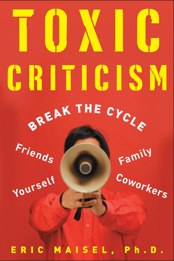
I have to agree with Janet. This cover is a big improvement over the last one, although just about anything would be as that one was so offensive...Do you spend a lot of time in the book yelling loudly at readers? [trying to make sense of the megaphone on the cover]. I'm an illustrator, and it seems like they could have picked a thousand different analogies for breaking a cycle without even using a human. Too bad they couldn't have chosen something more visually beautiful while expressing the idea of breaking a cycle.
This cover looks much more professional than the previous one. I would not need to hide this new cover with another book/bag when reading the book in public.
Hmmmmmm. Interesting comments! I feel totally the opposite. For me, the first cover is the one I'd buy. It's intriguing, expresses the topic perfectly, and is superbly designed.
The second cover looks like a first draft, an attempt on the way to good design. It's not terrible or anything. It's more that it's just adequate to me.
I'd probably not notice the second cover on the shelves.
Okay - second try (computer is misbehaving). In a nutshell, the new cover looks like a high school or yard sale poster - not an artful design. The cover is not provocative, and is disturbing to me. The megaphone reminds me of riot control, or the coastguard yelling that they are going to board our boat (which never goes very well!) Eric, your writing is superb and elegant, and I think the cover of this book should be as well.
This is a rather out-of-the-box idea...how about if you have artists and writers submit designs for the cover? I am sure one of your readers and loyal fans could come up with something splendid! Thank you for asking! Cathy Harville
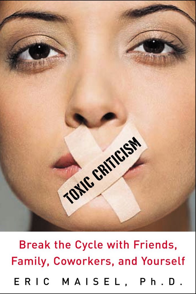
I don't think it's better than the first one. It's also inappropriate but in a different way. Mainly, the picture is irrelevant, silly, and arbitrary. It's as if the publisher is trying to give a serious topic a popularized, even frivolous appearance.
I'm with Roy on this one as far as design goes. While the first cover may be viewed as 'sexist' this could be solved by using a more androgenous looking face. I like the title text in the second one, but the picture is reminiscent of a 'Dr Phil' self help book and does look amateurish...
I am completely new to this author and I have never been on this website, but I am exercising my ability to create and connect with the universe, so I will offer an objective opinion here.
For me, the emotional response of the second cover is aggressive irritation. It's an eyesore, the megaphone expresses being sonically attacked, and the whole image feels like an ambush.
The first cover is stark and arresting. Attraction is inherent in the human response and the female face is attractive to me; whether through social conditioning and the beauty standard, she is attractive to me. The tape on the mouth sparks censorship, which I resist, further pulling me in by conflicted emotions and interest. It's an image that inspires me to feel. And one image is enough to spark the road you take when thinking "Do I explore the contents of this book?"
One image is no better or worse than the other, but I am drawn to the first image and repelled by the second.
This world is not separate from me, I do matter, and this seemingly unrelated event of seeing a book cover, has affected me.
I choose for the task to be that we understand that we matter to one another. Therein lies the connection we have forgotten and dissolves the need to subscribe to an illusion of separation; be it from you, me, or God.


15 comments:
Far better than the old cover.
Far better than the previous cover.
What a huge improvement! It now doesn't look like some sleazy, sensationalistic novel. :) Can't wait to read it.
MUCH better than the original.. .though I don't get the megaphone....
It's o.k. but who creates these covers anyhow? With all the work you put into writing it, can't they be a little more creative with the cover?
Janet
Congratulations on a much better cover. This one works.
I have to agree with Janet. This cover is a big improvement over the last one, although just about anything would be as that one was so offensive...Do you spend a lot of time in the book yelling loudly at readers? [trying to make sense of the megaphone on the cover]. I'm an illustrator, and it seems like they could have picked a thousand different analogies for breaking a cycle without even using a human. Too bad they couldn't have chosen something more visually beautiful while expressing the idea of breaking a cycle.
This cover looks much more professional than the previous one. I would not need to hide this new cover with another book/bag when reading the book in public.
Hmmmmmm. Interesting comments! I feel totally the opposite. For me, the first cover is the one I'd buy. It's intriguing, expresses the topic perfectly, and is superbly designed.
The second cover looks like a first draft, an attempt on the way to good design. It's not terrible or anything. It's more that it's just adequate to me.
I'd probably not notice the second cover on the shelves.
Blue skies
love
Roy
From my perspective, this is much better! Makes me want see more of what is inside. pwh
Okay - second try (computer is misbehaving). In a nutshell, the new cover looks like a high school or yard sale poster - not an artful design. The cover is not provocative, and is disturbing to me. The megaphone reminds me of riot control, or the coastguard yelling that they are going to board our boat (which never goes very well!) Eric, your writing is superb and elegant, and I think the cover of this book should be as well.
This is a rather out-of-the-box idea...how about if you have artists and writers submit designs for the cover? I am sure one of your readers and loyal fans could come up with something splendid! Thank you for asking! Cathy Harville
I don't think it's better than the first one. It's also inappropriate but in a different way. Mainly, the picture is irrelevant, silly, and arbitrary. It's as if the publisher is trying to give a serious topic a popularized, even frivolous appearance.
I'm with Roy on this one as far as design goes. While the first cover may be viewed as 'sexist' this could be solved by using a more androgenous looking face. I like the title text in the second one, but the picture is reminiscent of a 'Dr Phil' self help book and does look amateurish...
I am completely new to this author and I have never been on this website, but I am exercising my ability to create and connect with the universe, so I will offer an objective opinion here.
For me, the emotional response of the second cover is aggressive irritation. It's an eyesore, the megaphone expresses being sonically attacked, and the whole image feels like an ambush.
The first cover is stark and arresting. Attraction is inherent in the human response and the female face is attractive to me; whether through social conditioning and the beauty standard, she is attractive to me. The tape on the mouth sparks censorship, which I resist, further pulling me in by conflicted emotions and interest. It's an image that inspires me to feel. And one image is enough to spark the road you take when thinking "Do I explore the contents of this book?"
One image is no better or worse than the other, but I am drawn to the first image and repelled by the second.
This world is not separate from me, I do matter, and this seemingly unrelated event of seeing a book cover, has affected me.
I choose for the task to be that we understand that we matter to one another. Therein lies the connection we have forgotten and dissolves the need to subscribe to an illusion of separation; be it from you, me, or God.
One.
I like it and I get it! The megaphone guy represents all those criticisms from the past and future that need to be silenced!! I want that book.
Post a Comment